fupio

Fupio はオンラインで共有する最も簡単な方法です 詳しく見る »

Fupio に参加
CSS-Tricks

CSS-Tricks

A learning community for front-end designers and developers

CSS-Tricks
CSS-Tricks
The writing-mode CSS property sets whether lines of text are laid out horizontally or vertically, and the direction in which blocks and lines progress.
.element {
  writing-mode: vertical-rl;
}
This is most useful in languages such as Chinese, Japanese or …
writing-mode originally handwritten and published with love on CSS-Tricks. You should really get the newsletter

いいね(1)

LikesMehmet Kose がいいねしました

CSS-Tricks
CSS-Tricks
The pointer-events property controls whether an element can become the target of pointer events like clicks, hover states, and other pointer-based events. In other words, it lets you decide whether the browser should treat an element as interactive when the pointer is over it.
.no-pointer-events {
  pointer-events: none;
}
CodePen Embed Fallback
To understand how the property works, it helps to know what the browser does before it fires a pointer event. First, it has to determine

いいね(1)

LikesMehmet Kose がいいねしました

CSS-Tricks
CSS-Tricks
Similar to last time, What’s !important #15 is pretty stacked — read all about boundary-aware CSS, making grid lanes accessible, creating time-based web designs, fixing full-bleed CSS, improving customizable <select>, new web platform features, and more.

Using view() for boundary-aware CSS

Preethi Sam very expertly walked us through the concept of boundary-aware CSS

CSS-Tricks
CSS-Tricks
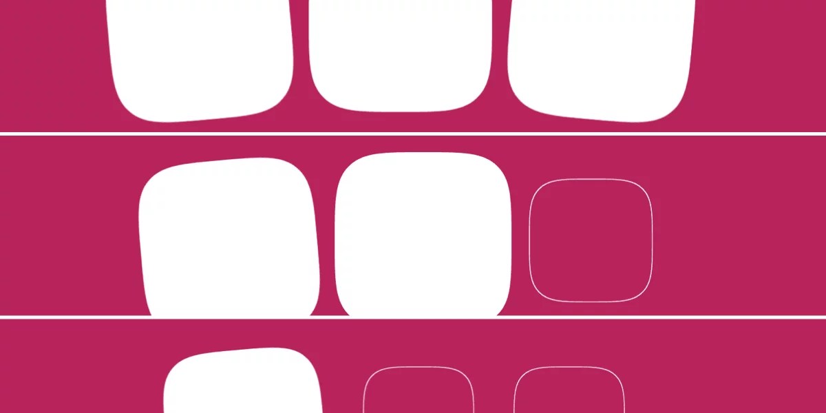
So, we recently got the new shape() function (now Baseline!) as well as the corner-shape property. What else could we possibly need as far as making shapes in CSS? Let me tell you: the border-shape property!
shape()? corner-shape? border-shape?! Where did all these come from?
If you are not a CSS shape fanatic like me, you probably missed these features when they came out,

CSS-Tricks
CSS-Tricks
I know you’re busy, so for What’s !important #14, I’ll be sprinting through what’s been a stacked couple of weeks despite few browser updates. From CSS Quake to CSS Gap Decorations, this isn’t one to miss!

Hyperblam: Make music with HTML

Heydon Pickering created Hyperblam, a HTML-driven implementation of the Web Audio API that uses Web Components to create music without JavaScript.
Okay, not very CSS-y, but still pretty cool!

CSS Quake

Powered by

CSS-Tricks
CSS-Tricks
CSS is listening to us. No, not like that. Rather, CSS is accumulating more and more pseudo-classes to help us respond to JavaScript events so that we don’t have to do so with JavaScript itself. But while pseudo-classes track states, not events, they sure can feel like event listeners sometimes (not that it really matters in the context of CSS).
Then again, what is CSS these days? For example,

いいね(1)

LikesMehmet Kose がいいねしました

CSS-Tricks
CSS-Tricks
The CSS translateZ() function adds depth to an element, drawing it closer or farther in space. In other words, it shifts an element along the Z-axis in a 3D space.
.box:hover {
  transform: translateZ(100px);
}

.box.perspective:hover {
  transform: perspective(500px) translateZ(100px);
}
Either the perspective() function or perspective property is necessary for translateZ() to work. Without either one, there’s no

CSS-Tricks
CSS-Tricks
The CSS translateY() function shifts an element vertically by the specified amount. Specifically, it shifts an element either up or down, depending on whether the value is positive or negative.
.parent:hover .box {
  transform: translateY(50%); /* Shift down by half the element's height */
}
CodePen Embed Fallback
Along with other transform functions, it is used inside the transform property.
It is defined in the

CSS-Tricks
CSS-Tricks
The CSS translateX() function shifts an element horizontally by the specified amount. Specifically, it displaces an element to the right or the left, depending on whether the value is positive or negative.
.parent:hover .box {
  transform: translateX(50%);
}
CodePen Embed Fallback
Along with other transform functions, it is used inside the transform property.
It is defined in the

CSS-Tricks
CSS-Tricks
The CSS translate() function shifts an element from its default position on a two-dimensional plane. This way, we can reposition an element horizontally, vertically, or both.
.parent:hover .box {
  transform: translate(50px, 50%);
}
Hover over the box to see it move 50% of its width towards the left:
CodePen Embed Fallback
Along with other transform functions, it is used inside the transform property.
The translate()

CSS-Tricks
CSS-Tricks
Sometimes designers have silly ideas that eventually grow on you. That happened to me with this concept where I had to build columns of items moving in opposite directions when a user scrolls the page.
CodePen Embed Fallback
Note: This demo respects reduced motion settings, so you’ll need to enable motion to see the effect. And we’re looking at Chrome and Safari support as I’m writing this.
It’s really not as hard as you might think, thanks to modern CSS features, specifically

CSS-Tricks
CSS-Tricks
Chrome has shipped scroll-triggered animations, and is the first browser to do so. If you update to Chrome 146, you can view the demo below, where the background of a square fades in over the duration of 300ms, but only once the whole element is within the viewport.
CodePen Embed Fallback
This is a bit different to how scroll-driven animations

CSS-Tricks
CSS-Tricks
I need you all to promise me you’ll be cool about this. I‘m here to tell you about an upcoming web platform feature that has been a long time coming; a feature that not only fulfills a use case sorely overdue for a better solution, but does so by way of a syntax that is both immediately understandable and deceptively powerful. That’s right, this thing is developer catnip, and I don’t mind saying that I was really excited to try it out — after which point I willed myself to tuck it away in a

CSS-Tricks
CSS-Tricks
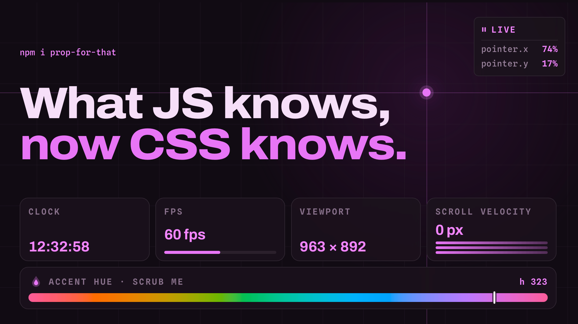
No secret that Adam’s all about props. Dude gave us Open Props a good while back for a slew of preconfigured variables for color, shadows, sizing, typography, among much much more. Now he’s back with Prop For That, a similar sorta idea, but mind-blowing in the sense that it creates live props based things CSS can’t normally see in the browser. Things like cursor position, progress values, certain form states, current time, scroll velocity — you know, the stuff

CSS-Tricks
CSS-Tricks
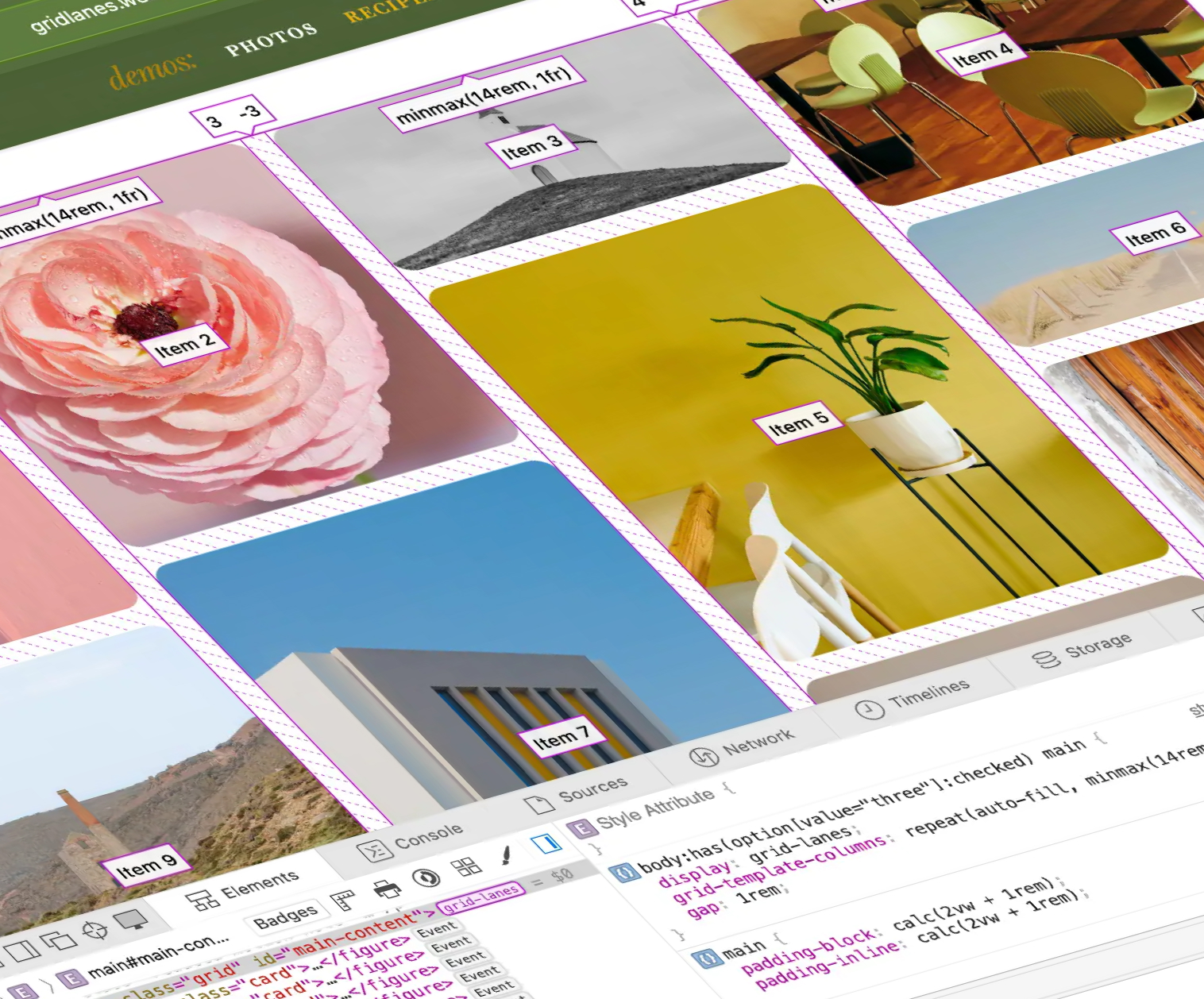
CSS functions, the alpha() function, Grid Lanes, some things about <dialog> that you might not know, CSS Wordle, and more — this is What’s !important right now.

CSS functions, expertly explained

Jane Ori expertly explained how CSS functions work. @function will probably be the biggest CSS feature to probably become Baseline this year, so I definitely found it a bit intimidating at first.

CSS-Tricks
CSS-Tricks
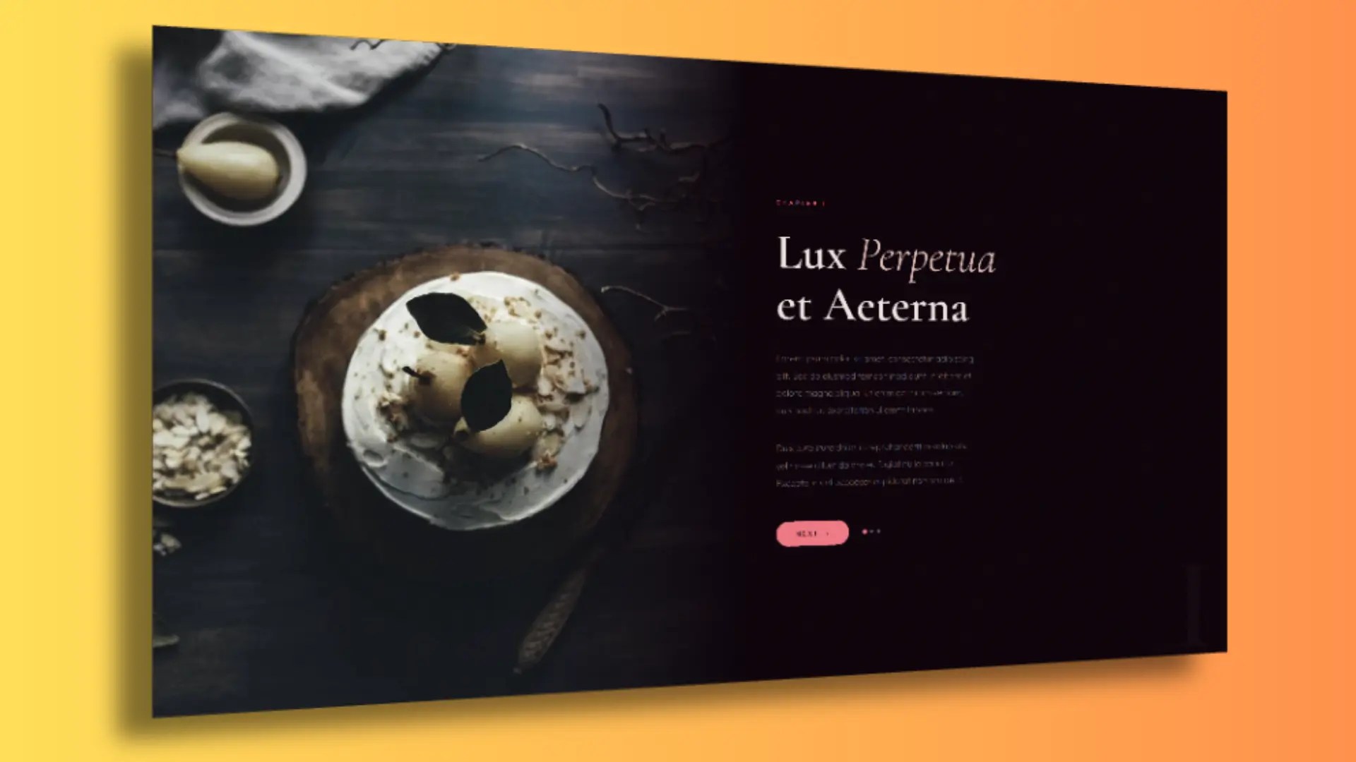
If you have played around with view transition a bunch, you may have noticed that 3D transitions between two pages (i.e., cross-document view transitions) don’t seem to work. That is, at least not without the browsers flattening things first.
Image elements are the best example to demonstrate this because, like the snapshots a browser takes of the before-after states in a view transition, images are replaced elements so,

CSS-Tricks
CSS-Tricks
Mark Underhill:
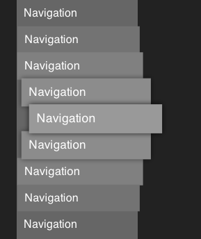
And now to the reason I wrote this post: including the word “navigation” in your <nav> labels. There’s no need. If we did, we’d hear something like “Navigation, Primary navigation”. Not the end of the world, but unnecessarily repetitive for screen reader users.
One of those nuances to keep in your back pocket when writing for screen readers. Reminds me, too, that there’s no

CSS-Tricks
CSS-Tricks
I love the fact that CSS is finally reclaiming control over visual interactions, taking charge of the styling, the animation, and the accessibility exactly as it should. Today, native browser capabilities allow us to move the heavy lifting away from the JavaScript main thread and closer to the GPU. By letting the browser’s engine optimize performance under the hood, we save energy and processing power while building code that is robust, accessible, and independent of external libraries that

CSS-Tricks
CSS-Tricks
I’ve said one and meant another, and I’ve used one when I needed another. Please bear with me as I note the high-level similarities and differences between scroll-driven animations, scroll-triggered animations, container query scroll states, and view transitions for my future self.

Scroll-Driven Animations

A scroll-driven animation is an animation that responds to, yeah, scrolling. Specifically, there’s a direct link between scrolling progress and the animation’s

CSS-Tricks
CSS-Tricks
Recently, Juan Diego Rodríguez published an excellent article exploring how far CSS can be pushed to build a semantic and customizable pie chart while keeping JavaScript to a minimum.
Citing Juan himself:
In this article, we’ll try making the perfect pie chart in CSS. That means avoiding as much JavaScript as possible while addressing major headaches that comes with handwriting pie charts.
And it stated some goals that I

CSS-Tricks
CSS-Tricks
The offset-path property in CSS defines a movement path for an element to follow during animation.
This property began life as motion-path. This, and all other related motion- properties, are being renamed offset- in the spec. We’re changing the names here in the almanac. If you want to use it right now, probably best to use both syntaxes.
Here’s an example using the SVG path syntax: